Monthly Educational Guide: Why You’re Better in a Contract with your IT Company
What happens when your business suffers an IT issue? Whether it’s suspected malware, a data breach, or a computer that refuses to connect to anything,

What happens when your business suffers an IT issue? Whether it’s suspected malware, a data breach, or a computer that refuses to connect to anything,
Your business couldn’t function without its technology, right? And from time to time, things go wrong. If these are the only times you speak to
There are two different ways to get IT support for your business. And they differ wildly. One of them is cheap and simple but has

Is upgrading to Wi-Fi 7 the right investment for your business? We look at the pros and cons of the next-gen wireless connection.

A new cyber security report has brought some bad news: Cyber attacks are getting stronger, faster, and more sophisticated. We have all the details.

Microsoft’s made another update to Windows 11, and while it’s a small one, it could make a big impact. We have all the details of what’s changing.
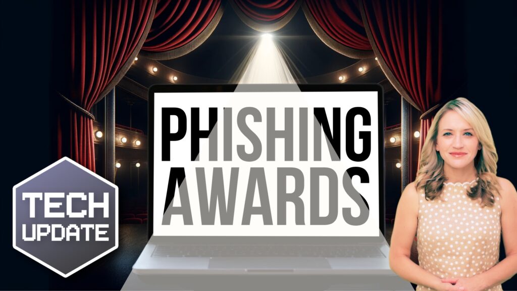
Which phishing scam are you and your employees most at risk from? We tell you about the most common phishing emails and the easy way to stay safe.
A cyber attack on a business unit of UnitedHealthcare, the nation’s largest insurer, has disrupted drug prescription orders at thousands of pharmacies for about a
You might remember in our last SPOT Cybersecurity Tips newsletter the story of how Microsoft made headlines in mid-January when they released their research into

Have you noticed your employees are reluctant to use AI in the workplace? It may be down to their lack of trust. We explain how to show them AI is a tool that makes work better for everyone.